No longer offering and updating our online ecommerce store. Please contact us for updated pricing and ordering via the form, email or call us. Thanks Dismiss
The best practice for trade show booth graphic design
Your trade show booth graphic design should be clean, clear, and simple. A trade show booth is like a billboard off the highway. People are walking by, trying to make it through the show and you have a short window to catch their attention.
What to include in your trade show booth graphic design
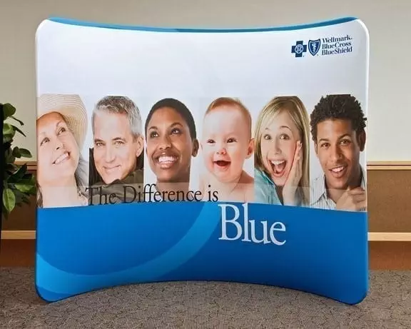
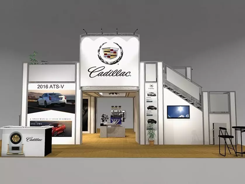
Your booth design should right away answer who is your company, what you do, and why you. So, the base of your design is your company name, services or products you sell, and your tagline. The text should be readable from a distance, clear, and stand out. Usually for this part bold fonts and single-color backgrounds are better. If you must add more text, bullet points are usually easier and faster to read. The point is keep the paragraphs for your printed materials like brochures, sell sheets, and/or catalogs.
Besides clear and easy to read text, you need clean and clear images of your products and services. If you are attending the show for a specific product launch let those images shine and stand out forefront. The images should relate to your trade show goals and coincide.
Keep it simple and clean
Too many people try to overdo the graphic design of their trade show booth and it just looks cluttered, unprofessional with no clear vision. Sometimes less is better and your trade show display design is one of those times.
Think of your trade show booth graphic design as an Instagram meet Twitter. Let your booth speak your message with beautiful images and 140 characters.
Trade shows are a big expense but can be very rewarding if done correctly. Follow these steps for your next trade show and see the difference it makes in your ROI.
Please feel free to reach out to us for all your trade show needs.